Five Tricks to Help Your Business Grow Appointment Booking Numbers

This post is also available in:
Any offline business faces the same problem as each online one: attracting people and raising conversions. The main ways to leverage the internet for traditional services are to widely represent themselves over the web and provide potential clients with quick and handy booking. If these conditions are met successfully, the customer flow (and profitability) is likely to increase substantially.
Such steps are reasonable because most people nowadays prefer to make as much as possible via the internet without interacting with sales reps. This approach gives absolute freedom when a user can perform the action online wherever and whenever they want. Besides this, with an advanced (automated) booking process, administrators can shift their focus from tedious work to more important duties like ensuring better service for guests who have already come to your beauty salon, dental clinic, gym, etc.
In this article, we’ll discuss five crucial moments that you should pay attention to. This advice would be equally valuable for all company sizes and individual entrepreneurs from various offline sectors: beauty, health, education, entertainment, sport, consulting, and other services.
1. Make Your Website Convenient
The very first impression largely determines one’s decision whether to use your service or not. There are two core parameters worth continuous development when it comes to websites: loading speed and usability. That’s why brands invest in developing the headless commerce architecture for their online stores/storefronts. It is the way to create faster sites with better UX/UI on numerous devices.
If you run a website with some offerings, take care of its presentable view. Let’s start with an anti-example (see the screenshots below). A company called Art CLASS London makes my eyes hurt by its website’s design. The layout is horrendous, to be honest. I didn’t expect to see such unfriendly and hard-to-use sites in 2021.
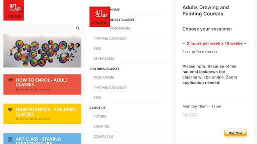
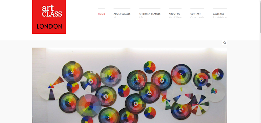
The drop-down menu’s pictogram on the mobile version superimposes on the logo; the header is almost empty; fonts and CTAs look awkward and obsolete. Some points in the menu aren’t clickable; some arrows don’t work. And if you visit the desktop version, you see that the main photo and logo are of unacceptable quality. Frankly speaking, I’d refuse to buy lessons here.
2. Make Your CTAs Clear and Vivid
Every call-to-action must be on fire! Almost literally. If a visitor doesn’t easily find where to tap, they just won’t place an order. So, work mindfully on these three moments: the placement, appearance, and titles of your CTAs.
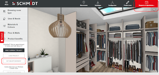
Take a look at how a French furniture brand Schmidt does its CTAs. Firstly, it has pinned the “Request an Appointment” button in the header on the page. It is red, and it contrasts with the adjacent tabs. My only nitpick is the message: it would be better to show it in full. Secondly, Schmidt duplicates the button once again when a user should decide what to do with the project that they have just created.
3. Make the Scheduling Process Effortless
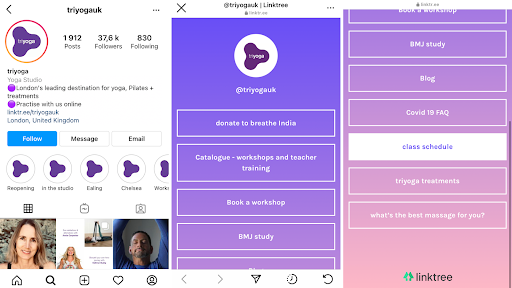
Another significant obstacle to successful booking is the way the process itself is organized. Let’s consider two bad instances. Take a look at the screenshots from the Instagram account of a British studio Triyoga.
If I want to book something on Instagram, I can use a special button (we’ll talk about them later), send a direct message, or tap on the link in the bio. But when I opt for clicking on the link, I still have to be attentive and patient. It turns out that the “Class schedule” option is somewhere at the bottom of the list.
In the following screenshot from an LA-based cleaning service, We Clean, we see two of the most outdated order placement methods: phone or email. While many companies have accustomed to using automated forms with lots of benefits for all sides, utilizing only calls and letters seems to be outlandish.
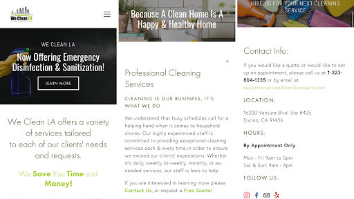
The only reason behind such negligence in both cases is that companies don’t need new customers. If yes, good for them! If not, it’s high time to fix the issues.
Look at the customer journey through their eyes: find the booking option and go through the whole booking process. Estimate how intuitive the path is and notice possible barriers. Then do your best to make the booking process swift and seamless.
4. Make Use of Reliable Scheduling Software
There are booking systems on the market (like SimplyBook) designed to ease the scheduling process for customers and automate it for businesses. You can either integrate a widget (if you have a website) or opt for a ready-made but still, customizable booking web page powered by a chosen service.
Professional solutions bring plentiful benefits:
- Online bookings 24/7 (people can count on the possibility to set an appointment even at night);
- Independency on the human factor (the system can’t confuse dates or schedule two events for a single time slot);
- All free spots are seen straight away;
- Automate confirmation emails;
- Calendar sync (people can see the upcoming appointments on their own devices);
- Social media integration (you can add the “Book Now” button to your accounts).
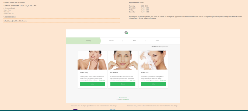
Below is a screenshot of the personal booking page of skincare therapist Kathleen Birch. The design looks neat; the navigation is simple. The booking form is clear and comprehensive, so it’s harder to make a mistake while scheduling.
5. Make it Possible to Book Via Social Media
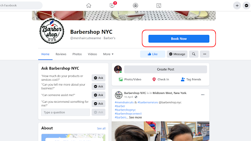
Many booking systems can be connected with Instagram and Facebook. Your followers will see the “Book now” button on your profile pages that can instantly redirect them to the corresponding form.
There are only a couple of limitations:
- Such an opportunity is suitable only for Business pages;
- On Instagram, the booking button is available only in the mobile app (not on the desktop version).
Enabling this feature will reinforce your omnichannel connection with regular, rare, and prospective customers. In the screenshots below, you can see how Barbershop NYC leverages this compatibility between social media and booking services.
Wrapping Up
Currently, offline entities depend on the internet not less than eCommerce and other purely online services. To engage new consumers, ensure an exceptional user experience, and convince them to choose you again, you should work out truly seamless interaction strategies. Use these five hints to help your company raise the number of appointment bookings.
Guest Author Bio: Kate Parish

Kate Parish is the Chief Marketing Officer at Onilab with over 8 years of experience in Digital Marketing in the sphere of eCommerce web development. Kate always aspires to broaden her competency in line with cutting-edge global trends. Her primary areas of professional interest include SEO, branding, PPC, SMM, Magento PWA development, and online retail in general.
Comments
2 comments