Email Marketing Tips & Tools – Part 2: Defining Goals & Choosing Campaign Templates
This post is also available in:
So, you’ve had time to think about what you should and shouldn’t do with email marketing. You’ve also contemplated the effective use of subject lines, personalisation, and segmentation. If you missed last month’s article on Email Marketing Tips & Tools – Part 1: Dos, Don’ts and Personalisation, check that one out before reading any further here. This month I’m going to focus on how you define your goals for your email marketing campaign. I’ll also delve into the email campaign templates you could use for those objectives.
Defining (Measurable) Goals
Much as your overarching and ultimate goal is to increase revenues, sales, and customer base, as a goal for your email marketing campaign, it lacks a measurable metric. The aim of your email campaign should have a specific and measurable outcome.
To highlight how inadequate “increase revenues” is as a metric for the success (or failure) of an email marketing campaign, think about how you would measure it. Your revenues might increase or decrease, but how do you know it had anything to do with your email campaign? For measurable metrics for your campaign, we need to look at the quantitative aspects that lead to increased revenues.
- More website visitors
- Increased blog subscribers
- Greater social visibility & posting
- Increased conversion rates
- Increase in initial spend
- More online bookings
- Improved SEO
That’s not even a full list of the potentially measurable outcomes that could result FROM an email marketing campaign but can result IN increased revenues.
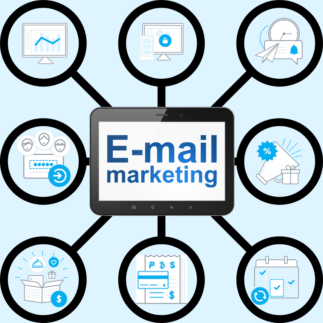
Choosing Your Email Marketing Campaign Type
Now you have your measurable objectives for your email campaign; it’s time to decide HOW you will go about achieving those goals. It’s all about presentation and targeted content. You wouldn’t wear your decorating, ragged clothes to a corporate job interview, and in the same way, you wouldn’t use a newsletter to promote a new offer.
Practically, the types of email campaign template fall into five different categories—however, each of those you can breakdown further to better target your audience.
- Informative/Educational
- Marketing/Promotional
- Announcement
- Invitation
- Transactional
These are the five basic types of email campaign that you will use to target your audience and drive the measurable objectives you have defined. Now, with five different basic types of campaign template, it makes it very easy to split it up into the well-known 80-20% rule. Eighty per cent information and twenty per cent promotional material is the general rule of thumb for email marketing shots.
However, it doesn’t always work that way because the point of all marketing campaigns is “marketing”. But if you try to keep your marketing and promotional content to 20% of each mail shot, you are probably on the right track.
So, which email campaign template works best for your stated objectives?
The Different Email Campaign Templates
When you break down the five campaign types, you get something like this:
Informative & Educational
- New Content
- Service or Product Updates
- Newsletters
Marketing & Promotional
- Offers
- New Products & Services
- Co-Marketing
Announcements
- Changes to policy*
- Company Updates*
- Dedicated Send (already enrolled, members etc.)*
Invitations
- Events
- Invitation Only Services
Transactional
- Welcome messages*
- Booking/payment confirmation emails*
- Thank you mails*
*Note the mail templates marked with an asterisk. These emails are those that you can usually send without becoming embroiled in a debate over whether they constitute “marketing and promotional materials”. It’s common for people to opt-out of promotional messaging actively. However, many people acknowledge they need to get updates, confirmation messages, and welcome/confirm your email address mails. They know it’s a trade-off. While you don’t want to overdo it, you can usually slide a small promotional element in there without upsetting anyone who opted out of the marketing emails.
Essential Components of ALL Campaign Emails
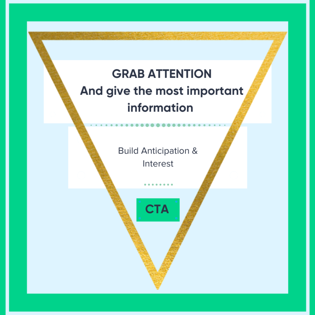
It might seem something of a gross oversimplification, but there are seven key elements to a marketing campaign template that promote opening and responding. One study claimed that we (humans) have an attention span of about 8 seconds – the study was debunked entirely, but I suspect it’s not far wrong when it comes to scanning emails. Consequently, your email has to grab attention and prompt response within seconds of opening the email.
A Catchy Subject Line
Keep it short but sweet so that it shows well on mobile devices too. Avoid click-bait, but make the client curious.
Information-rich preview text
Don’t let email providers fill this in for you, with a salutation or an unsubscribe link because that’s the first thing on the page. Get your info in front of the reader before they’ve opened the email. Make them WANT to open it – there’s only so much you can do with a super-short subject line.
Engaging (accurate) Copy
Again, keep it short, concise and use the white space. Most people only flick through marketing emails from promotional sources. Keeping text to brief paragraphs and short sentences increases a person’s ability to scan more quickly.
Visually engaging imagery
Relevant and appropriate images are usually* a must. Sometimes, it’s an excellent idea to switch things up and go with text-only emails, which makes it seem more personal and individual – one person to another. You don’t send emails to your friends filled with images and fancy videos, do you?
A rock-solid call to action (CTA)
It takes you where you need to be to complete the activity. You want the email recipient to DO something measurable, take them directly where they need to be to do it. The fewer clicks, the better.
Social Links or buttons
Make them prominent. The best email marketing and promotions get shared, whether that’s by forwarding an email or posting on social media. What’s more, if you want to reward your existing client list for referrals, you need to make it easy for them. One-click, and done!
I have to add that you NEED an unsubscribe link on ALL marketing emails. It’s a legal requirement, and you don’t want hitting with a hefty fine while trying to “increase revenue”.
Remember what I said about the short attention span? Well, we start off okay, but our attention wanes as we scan through emails. So the best layout for an email campaign template uses the “Inverted Triangle” for the optimum attention-grabbing (and holding) pattern.
Newsletters are a Little Different
While the inverted triangle still remains valid, even with a newsletter, the format changes slightly. Instead of your page being one big inverted triangle of information, it becomes a list of smaller inverted triangles within the big triangle.
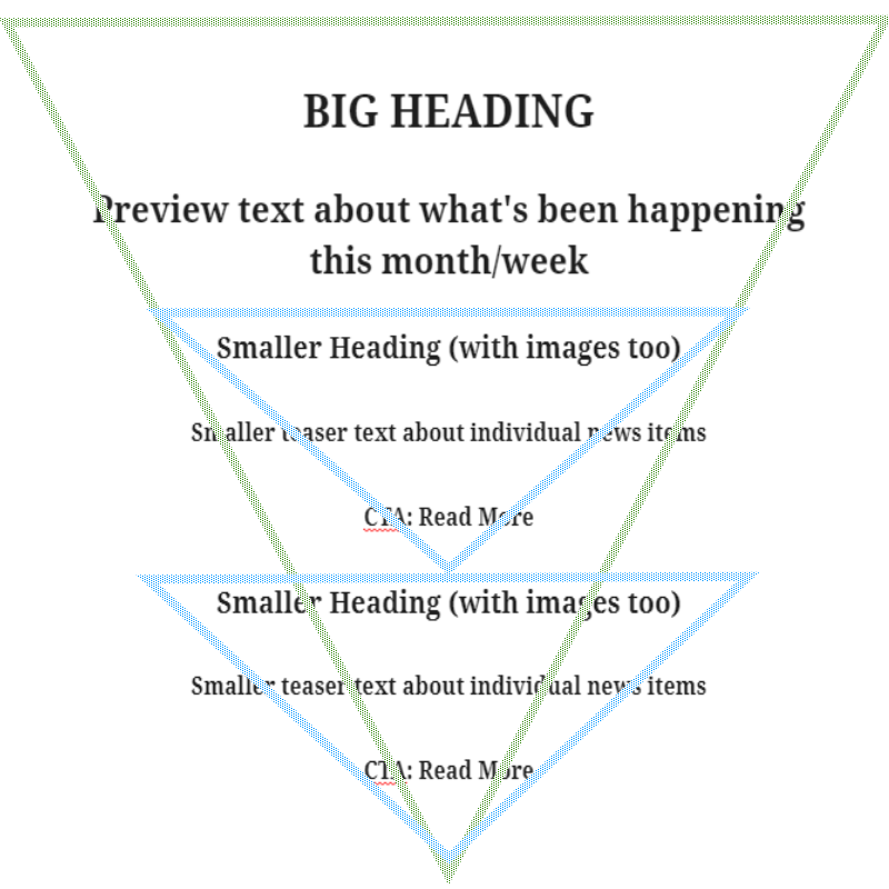
It’s all about grabbing the attention with headlines and images and letting people choose the bits that appeal.
Matching Your Goals with the Right Message Delivery
I’ll start with the basics that you might want to achive with your email campaign
More website visitors
You want this to be an informative and/or educational inspired post, but you also want it to be brief. How can you drive traffic to your website if you give your clients (or subscribers) all the information they need in the email? Think about listing the services you provide with a little teaser of information followed by the CTA
CTA: Learn More (about us & what we can do) or Read More
Increased blog subscribers
The ideal placement for adding subscribers to your content is in the updates and confirmation emails. You’re being informative and ensuring that your clients stay up to date with the company policies. What’s more, you want them to stay up to date will ALL of your updates. Placing a “reminder” nudge at the bottom of a welcome mail, such as “how to stay n the loop” is not obtrusive. Likewise, the same applies to company updates and policy announcements.
CTA: Subscribe or Stay in touch!
Greater social visibility & posting
Promotional, yet rewarding for both your business and your clients. This can be short and sweet with a promotional offer. Reward your clients with a discount or gift voucher for referring clients to your business. What you want to reward is up to you. Whether you pay up for social posting, forwarding the email, a referral making an appointment, that’s between you and your clients.
Don’t forget your social buttons, they are your friends, in this type of campaign more than any other.
CTA: Social Buttons!!!
Increased conversion rates
This is a tough one to work work with, and you probably won’t get it right the first time, unless you have a firm grasp of the elements that convert your clients. What do your converting clients like most about your business? Do you have the best blog with tonnes of original and useful information? Maybe you have better pricing than any of your competitors.
It’s a good bet that many of your conversions come from your amazing testimonials, prices, and that little extra that you put into your interaction with your customers (valuable information, customer support, help articles etc.). The key to this one is to make it informational and engaging. You could use a newsletter, a company update or a deep dive into the benefits of your service business.
CTA: READ MORE
Increase in initial spend
It’s a common marketing tactic, when a new client signs up for a product or service but fails to complete the purchase or booking, to offer a promotional discount to prompt a conversion. The majority of the time, this leads to a bigger spend amount than they would have made without the offer. We, humans, are bizarre, yet strangely predictable, creatures.
It’s a nice touch to add a countdown timer to the CTA to really push for the completion. However, this can sometimes work the opposite way. It depends very much on the client.
CTA: Claim Your Voucher!
More online bookings
If you have recently implemented an online booking system, it’s a good bet that you have a significant section of your existing clientele still using the “old way” of booking an appointment. As such, you aren’t really seeing the benefits that you wanted. Offer your existing clients a promotional ‘discount’ for booking online with a nice big CTA that will take them straight to the booking page.
Alternatively, you can make all of the prices on your online booking system 5% cheaper than those advertised on-site, and claim it as an online exclusive for using the booking system.
If you want to push the boundaries of this campaign type, you could even double the discount if they book with a friend. Lots more online bookings!
You could even make this an informational email about the benefits of online booking for ease of use, 24/7 booking confirmations and much more.
CTA: BOOK NOW
Don’t forget to include your killer subject lines, personalisation, and careful segmentation of your client list.
Come Back for More
That’s all for today guys, come back next time when I’ll talk about using campaign management tools like SendInBlue, Mail Chimp and the dozens more that are available. We’ll look at analysing your feedback, your measurable metrics, A/B testing, and making better decisions next time. Sadly, you can’t analyse data until you have it.
Comments
2 comments