The New Interface Menu- Easier and More Intuitive Navigation
This post is also available in:
You might have noticed that we’ve made some changes to the dashboard interface and navigation properties. We did this because a recurring theme in our feedback was that the interface was not as intuitive and easy to manage as it could be. So we took steps to correct that. With seven significant changes to the new interface menu, we thought it would be a good idea to walk you through the differences.
ALL Your Booking Channels

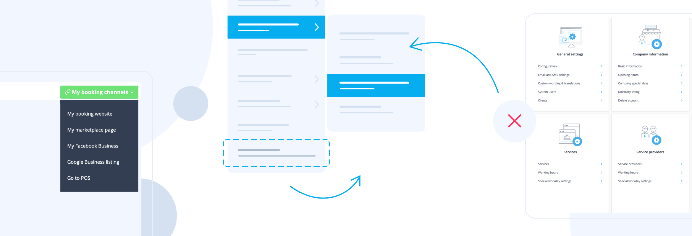
Whichever booking channels you have set up, you can access them all here. You can access your Booking Website, Facebook, Google Business, Booking.page, and even your on-site POS system from the My Booking Channels menu at the top right of your SimplyBook.me interface.
As a result, there’s no more navigation around the marketing suite to find your different booking channels and modify your setup.
Manage Feature Configuration, Staff and Clients
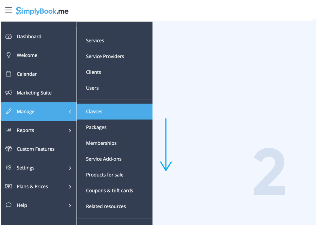
The Manage section is split easily into people and service and custom features. All your enabled custom feature configurations will be available from this menu, as well as your client, user and service management.
The listings for Services, Service Providers, Clients and Users will always be there. The menu items for each of your custom features will appear as you enable them, and will disappear if you choose not to use them anymore.
Click on any of the Menu items, and it will take you directly to the configuration and set up pages for each item.
Monitor Your Data and Reports
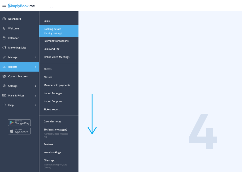
In an effort to make finding the correct reports more accessible, we have created a new interface to the reporting menu. This makes it far more straightforward to find and monitor all your necessary information.
The available reports will change in response to your enabled custom features – there’s no point reporting on memberships if you don’t offer them.
Even with one report open, you can open the reports tab and switch from one to another and you can open the report you want.
If you wish, you can also right-click on any of the different reports and open them in a new tab – enabling you to filter reports and switch between them for complex comparisons.
Configure settings
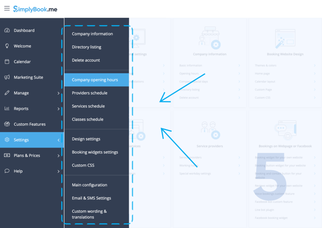
Instead of making you find your way around the large settings page you can now find what you are looking for in the expanded menu.
Now we have updated the menu navigation. It is easier to find everything you need from one menu.
Everything you need to set up and configure your SimplyBook.me account is here:
- Company Information
- Schedule Details
- Design Settings
- Business Configurations
Access Help
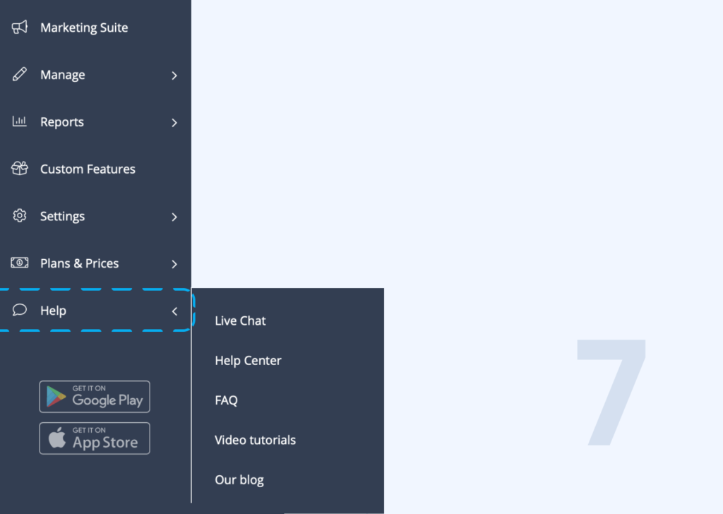
Do you need some help? Whether you want to chat with a customer support rep or find answers to your questions, it’s all in the Help Menu.
Further Updates to the New Interface
This menu and navigation update is only the first of several updates to our admin user interface. You will see further enhancements and upgrades over the next few months, all of which are designed to make your navigation and booking management more straightforward.
Stay tuned for more updates to make your scheduling and business management even more simple.


Comments
0 commentsNo comments yet