The Psychology Behind Great Subscription-Based Pricing Pages

This post is also available in:
Subscription-based services have been seeing a steady rise in popularity over the past decade. According to Statista, the average US Millennial had 17 paid media and entertainment subscriptions in 2020. Moreover, US users spent as much as 4.5 billion dollars on App Store subscriptions alone over the same year. Evidently, consumers and businesses are increasingly ready to pay a monthly (or yearly) fee for using a service. But at the same time, the market is slowly becoming saturated with companies competing for their attention and money. With this kind of competition, subscription-based businesses must learn how to appeal to and win over consumers. And that requires building great subscription pricing pages.
Thankfully, science, consumer behavior, and psychology can help.
Are you looking for pricing models or landing page tricks that will positively impact your conversions and minimize churn rates? If that’s the case, the following tactics might be worth considering for your website.
1. Charm Pricing
It shouldn’t come as a surprise that one of the most effective ways to convince consumers to invest in a product (subscription-based or one-time purchase) is to use one of the oldest tricks in the book: charm pricing.
Charm pricing, which is also called psychological pricing, refers to the practice of using odd numbers to display prices. Essentially, when using charm pricing, a brand doesn’t price a product at $300 but uses $299 instead. According to an MIT study published in 2003, this is effective because the number 9 at the end of the price “acts the same way a sales sign does.”
But, that’s not the only reason charm pricing works so well. The left-digit effect is a phenomenon in which consumers’ perception of a price depends on the number they see first. So, $2.99 appears to be cheaper than $3, even though the buyer only saves $0.01, which is next to nothing.
Nonetheless, there are some limitations to when charm pricing in this form works best. It turns out that three-digit numbers hit the sweet spot. Anything higher, and the perceived savings won’t appear that attractive.
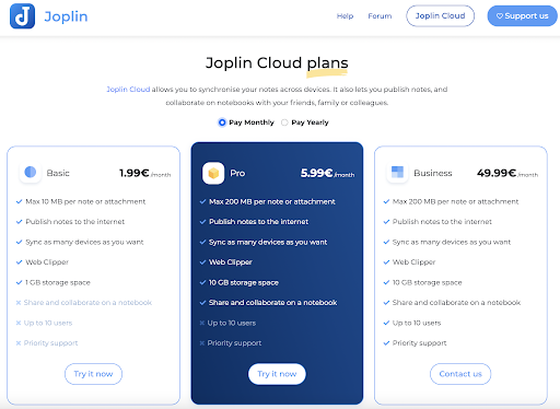
To see this principle in action on a SaaS pricing page, check out the Joplin app, which implements it beautifully. The landing page uses odd numbers and combines charm pricing with the center-stage effect, making its Pro plan the favorite amongst potential customers.
2. Social Proof
Another super-popular method for building great subscription-based pricing pages is to enrich them with social proof.
In theory, the idea of social proof relies on the presumption that a person uncertain about how to act in a social situation is most likely to look at their peers and imitate them. In marketing, this means that providing social proof convinces consumers to invest in products they don’t know in-depth.
On pricing pages, you can do this in two ways. On the one hand, you can use testimonials from existing customers to point out the benefits for potential buyers. Or, you can let the numbers do the talking and show how many downloads or satisfied customers you have.
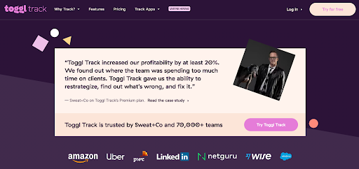
As an example of a subscription-based service that does both, check out Toggl. Its pricing pages include testimonials, numbers, and links to case studies. Plus, there’s an impressive list of customers (including brands like Amazon and Uber).
3. Price Appearance
Another great psychology-backed strategy for designing your pricing pages is to pay attention to how prices appear when written out.
Research from 2009 has shown that restaurant guests shown prices in numerals only tended to spend more than those whose menus included dollar signs ($) or prices written out in words. It appears that displaying the price of a product as being “19” instead of “$19.00” has a higher chance of convincing potential buyers to invest.
Of course, on subscription-based pricing pages, you can’t exactly ignore details like currency or payment frequency. But, you can do something along the lines of InFlow Inventory. Use numbers in their most effective form, then provide the rest of the information in a way that doesn’t increase the perceived cost of the product.

4. The Paradox of Choice
Sometimes, website visitors fail to convert because they experience a psychological phenomenon called the paradox of choice. American psychologist Barry Schwartz first introduced this concept.
The basic idea behind the phenomenon is that the more choices consumers have, the more difficult it is to make a decision. And, if there are simply too many choices, they will give up on their purchase altogether. So, to prevent this decision-making paralysis, brands should, essentially, try to limit the number of choices they offer to consumers.
The great thing about implementing this psychological principle on subscription-based pricing pages is that it can effectively boost conversions. By limiting distractions and optimizing your landing pages to direct consumer actions, you won’t “just” help your potential clients choose the best product for their needs. On top of that, you can also minimize bounces and prevent your audience from going to your competition.
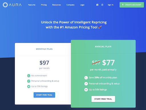
For an excellent example of a brand using the minimum number of choices on its pricing page, check out Aura. Offering only a choice between monthly and annual subscriptions, the brand helps consumers pick their preferred subscription plan without forcing them to think about missed features.
5. Prestige Pricing
As the antithesis to the charm pricing approach, prestige pricing aims to present costs by rounding up numbers. The point of this strategy is to appeal to consumers’ feelings instead of their cognition.
According to a research study published in 2015, shoppers gain the subjective experience of a shopping decision “feeling right” when the price is shown in rounded numbers like $100. However, when sellers use decimals or odd numbers to price items (like $99.99), they appeal to the cognitive aspect of the decision-making process, trying to convince buyers that they’re getting a deal.
So, if the goal of your product pricing pages isn’t to appeal to consumers wanting to save money but to convince people that they’re making the best possible choice, it’s not a bad idea to consider the prestige pricing approach.
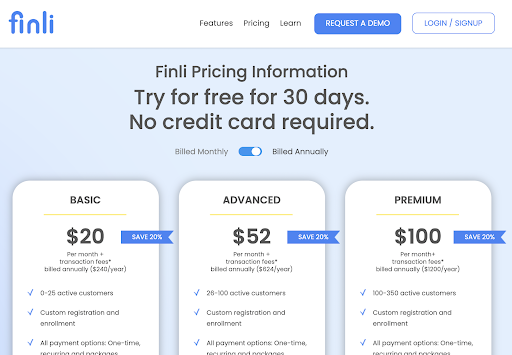
As you can see in this example by Finli, it can even be used to favor your preferred product tier by rounding up the price on the subscription plan that you want people to choose.
6. Innumeracy
Sometimes, the best way to convince people to subscribe to a service isn’t to rely on pricing at all. Instead, it is to offer them something extra without forcing them to think about numbers or math.
As a term, innumeracy signifies people’s inability to understand and use numbers in calculations. And data from 2012 suggests that offering discounts may not be the best way to appeal to shoppers. Instead, marketers suggest “translating” deals into simply-worded benefits everyone is sure to understand.
For example, instead of saying that subscribing to a service for a whole year lowers the monthly subscription fee by 20%, brands can offer two months free to anyone who subscribes to an annual plan. If you do the math, you will see that the first option actually adds up to a lower price. But, statistical data shows that people will be more likely to choose the latter option simply due to their inability (or unwillingness) to deal with numbers.
To see this pricing strategy in action, compare the following two annual subscription pages.
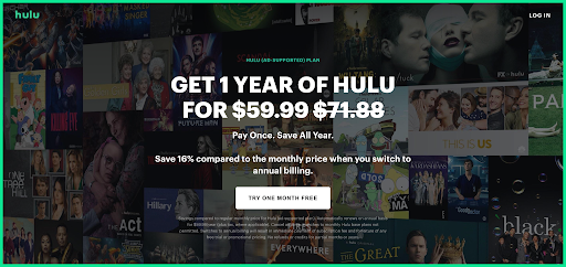
The first one by Hulu uses numbers and percentages, showing users that a yearly plan costs $59.99 instead of $71.88, that is, 16% less.
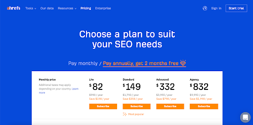
But, the pricing page on the Ahrefs website does something much more brilliant. Instead of relying on numbers, it simply offers two months free. Then it uses design to help this offer stand out. Sure, the numbers are still there, and anyone willing to do the math can check them. But, based on consumer psychology, most people will just go for the best-sounding offer without bothering to do the math.
7. Product Bundling
Do you have a wide variety of products and want your pricing pages to encourage subscriptions that maximize customer lifetime value? Well, it might not be a bad idea to consider product bundling for your subscription-based pricing pages.
The idea behind product bundling is to offer potential buyers something more than they originally came for and convince them to take the plunge by having them spend just a little bit over their intended sum. The benefit you get is a higher monthly income and a bigger number of users for products/services that may not yet have a large base of users.
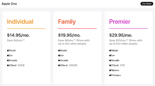
For a great example of a company using bundles in this manner, check out the pricing page for the Apple One service. The highest tier includes six services in total. But, seeing how it replaces six competitor products with a single solution (plus offers $25/mo savings), it’s an excellent way for the company to popularize its new services like Fitness+ or Arcade.
8. The Trial Hook
Lastly, when creating pricing pages for your subscription-based products, it’s not a bad idea to consider the amount of risk potential new customers face when deciding to invest in a solution. Essentially, the higher the price of your service, the more friction and resistance there will be.
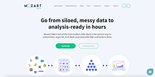
With this in mind, from a psychological standpoint, it’s not a bad idea to consider a free trial hook. This will give potential customers value for free and get them “hooked” on that value so that they’re convinced to keep paying for a service. As you can see from the example below, this is precisely what Mozart Data does, choosing to focus entirely on benefits and leave all discussion of payment for after the 14-day trial.
According to benchmark reports, the expected conversion rate for this strategy can range anywhere from 25% to 60% (when done right). So, if you’re open to implementing it on your pricing pages, it’s definitely worth a try.
Choosing The Best Pricing Strategy for Your Brand
When designing pricing pages for your subscription-based services, you might be tempted to choose the popular pricing strategies in your industry. And, sure, this can prove to be a good choice. But, it can also leave a lot of room for improvement.
The best possible way to choose a pricing strategy for your business is to think about your customers. Who are they? What type of solution do they need? What is the unique value that you can offer?
By having a well-developed buyer persona, you can make the absolute best product for your target audience. Even more, you can identify the exact points that will drive that audience to convert. And that includes finding the optimal way to present and justify your prices.
Author Bio

Travis Jamison is an entrepreneur turned investor. After selling a couple of businesses, he shifted his focus toward investing. But he was disappointed by the lack of options for entrepreneurial-type investments – like buying websites & investing in small, bootstrapped businesses. So he started Investing.io to provide a home for other entrepreneurs turned investors.
Comments
0 commentsNo comments yet