Design Settings for Your Simplybook.me Booking Website
This post is also available in:
![]()
![]()
![]()
We quite often talk about all of the custom features that make scheduling appointments and running your service business easier. However, today, I want to talk about the design settings that are standard to the SimplyBook.me system and how you can build a gorgeous and functional booking website with the fundamental tools available.
When you first sign up with SimplyBook.me, and start to fill in the details that will make your booking website functional, you might not have all of the necessary information to hand. That’s okay; you can always go back and make adjustments that will improve the appearance and functionality of your booking website.
If you want to make changes to your booking website design, sign in to your dashboard and navigate to Settings > Design > Themes & Colours
Theme and Template Designs
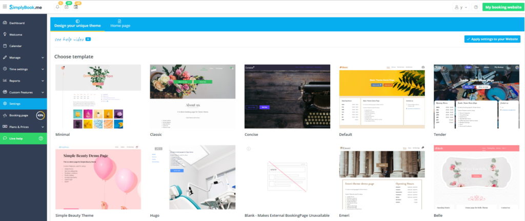
We know that no two companies have identical requirements for their websites and that preferences for appearance vary from business to business and industry to industry. However, across industries and businesses, there are some common threads in necessities and choices that we have built into our 20 (and growing) theme templates.
It’s important to realise when choosing your theme that you don’t have to like the design elements. You need to select the layout and form of the template, rather than being influenced by the design elements, such as colour schemes, banner images – they are all customisable for your business and brand.
Let’s look at the rest of the design settings after you’ve chosen a theme template.
Logos & Banners
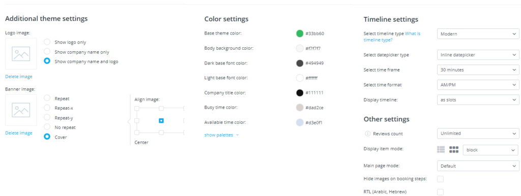
This is where you upload your logo image and the appropriate banner image. In many of the themes, you can see that the banner image sets the tone of the home page, so you will want to choose that image (or range of images through which you can cycle) carefully.
Uploading images is simple with ‘Drag and Drop’ functionality. Alternatively, you can browse your device folders for the correct picture – more accessible with devices such as tablets.
If you are just starting, and you don’t have a logo or definitive identity yet, you can wait. However, if you want a hand in that direction, check out Logopony in a previous article – along with some other useful tools.
Colour Palettes & Identity
If you already have a brand identity, such as a logo, name and colours that clients associate with your business, keep them. To make sure your brand colour palette stays the same across your different media, you can specify the hex code for the colours.
Timelines & Calendar Display Settings
How you display your available appointments depends on your schedule and the type of services you offer. To decide on the timeline type you think is best for your service offerings, you might want to check out one of our previous articles on timeline types and how they work.
Tailored Language –
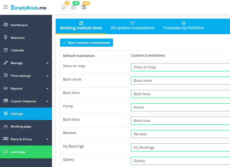
It depends entirely on the services, rentals or events that you provide, but you might want to change the text to support your business. Custom translation doesn’t just mean the language you use but also the way that you use your words. A dialect coach could use customised language to describe a particular accent or linguistic nuance. Maybe your target is the super-trendy youth, and you want to use up to date slang, in-keeping with the theme of your business.
Perhaps you want to make simple alterations, Instead of “Book Now” on your home page you might want to say “Make an Appointment” or “Set the Date” – this is a good one for wedding planners. There’s no point getting started with planning if the planner doesn’t have that date free.
If you want to alter the language that you use on your booking website, go to Settings > General Settings > Custom Translations.
Other Design Settings?
I said I wasn’t going to talk about the custom features, but are you aware that the Custom CSS feature is available for design settings on both your booking website and a website widget integration? The Custom CSS feature is one of our many customisable features, but it is FREE – that is that it doesn’t count towards the custom feature limit in your subscription package. Here you can change the appearance of your booking website, and tailor it to your specific style guide. You can make website widgets that blend seamlessly into an existing website.
We don’t recommend Custom CSS to anyone not familiar with it, but in the digital age, almost everyone knows a ‘techie’ that might be able to help. To find the Custom CSS feature, go to Custom Features > Look & Feel > Custom CSS
The Options are Flexible & Varied
There are so many options available that it’s almost impossible for another business to have the same website as you. The amount of flexibility in the design settings means that your booking website can be as much a reflection of your business and brand identity as a custom-created website – significantly cheaper, too.
Don’t forget!
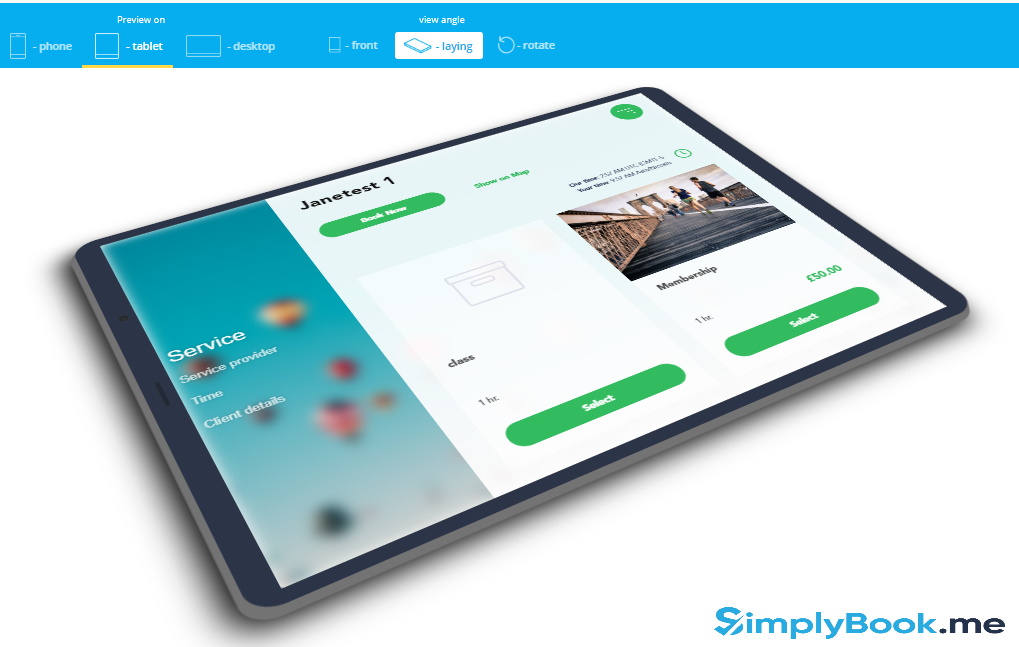
When you’ve finished, your design settings, and you think your website is ready, check the appearance on the likely devices. Desktop/Laptop display is straightforward, but do you know how your setup will appear on a mobile phone or tablet and rotated? The display previews at the bottom of the design page will show you exactly how your booking website will look, and you can click through the pages of the site the same way a customer would.

Comments
0 commentsNo comments yet