5 Steps To Build An Appointment Booking Landing Page That Converts
This post is also available in:
The ability to have steady clients that patronize you is the lifeline of any consultancy, coaching, or mentoring business.
Since many of these businesses now operate online because it’s the easiest way to get more clients, the need to have a high-converting landing page for appointment booking has become necessary.
As an online business owner who wants to acquire more skills and knowledge, I have booked online appointments with some people I consider gurus in my field to tap from their wealth of experience.
However, my experience booking appointments with some of them was terrible.
No, thanks to poorly built and designed landing pages. For example, it took time for the booking to submit, there were no testimonials to build trust and in some cases, the CTA button wasn’t visible.
All these are bad user experiences that turn off potential clients and make you wonder why your appointment booking landing page doesn’t convert.
It’s one thing to be a top-rated consultant or coach that is high in demand, and it’s another to build an appointment booking landing page that converts.
If you’re one of those consultants, mentors, or coaches who are thinking of setting up an appointment booking landing page, or you have one that doesn’t convert, this guide is for you.
I showed you 5 steps to build one that will generate high-quality leads and sales.
Why do you need an appointment booking landing page?
The need for an appointment booking landing page can’t be overemphasized. Below are major reasons you need them as a business that offers services online:
- Clients can schedule appointments at their convenience time
- It shows professionalism and increases your worth as a service provider
- It boosts customer satisfaction, which leads to repeated business
- It’s a competitive edge over your competitors who don’t have one
- It serves as a means to collect data that can help improve the quality of service you offer
1. Choose A Suitable Platform
The first step to building a high-converting appointment booking landing page is choosing a suitable platform.
Nowadays, there are a lot of software for it but identifying one that suits your needs isn’t easy.
Simplybook is one of the reliable platforms for building your appointment building landing page. I have taken time to explore it and trust me, it offers advanced features that provide great user experience, which in turn leads to more bookings.
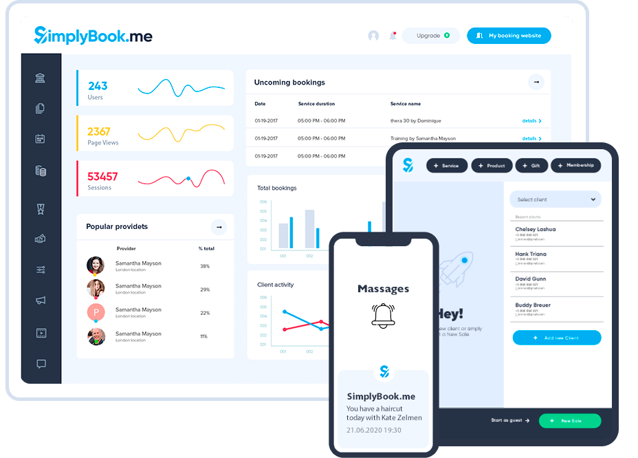
It has lots of pre-made templates which you can edit and customize to suit your needs. Each template has a demo which you can preview and see how it looks should you decide to use it.
Making payments is a breeze, thanks to its multiple payment processor that supports PayPal, Stripe, or credit cards via its POS system.
I like the SMS and notification system that notifies you or your staff in real time when a booking is made, canceled, or rescheduled. It integrates with popular marketing tools and has an API for you to connect third-party tools.
Above all, it’s mobile-friendly, which means your clients can book appointments using their smartphones, and you can manage all appointments while on the go.
There are also appointment booking page builders like Wix and Calendesk which you can check out to see if they offer the features you want.
2. Choose A Simple and Clear URL
Your URL is the first thing a potential client will see when they want to visit your appointment booking landing page. It makes the first and most important impression about your services.
Think of it as a customer who wants to locate your brick-and-mortar office. They will get confused if the office signpost does not convey the services you offer and in most cases will leave thinking they are in the wrong address.
The same happens when a potential client clicks your appointment booking landing page and the URL doesn’t suggest the service they are looking for. They will immediately hit the back button thereby denying you the opportunity to convert them to leads.
Make your URL simple to remember and customize it to ensure it reflects the services you provide.
A good approach is to use a keyword that suggests the service you offer and location.
Let’s assume you are a property lawyer in New York.
Your appointment booking landing page URL could be www.newyorkpropertylawyerappointment.com
Chances are this URL is taken. But you can play around with the keywords which are New York, Property Lawyer, and Appointment to come up with something unique that is related to your service and that your clients can familiarize with and also remember easily. The idea is to keep it under 5 words.
3. Make Your CTA Button Clear
No matter how appealing your appointment booking landing page is, if the call-to-action button isn’t clear, you may never generate qualified leads. Your CTA button tells your audience the desired action you want them to take. If it isn’t clear and straightforward, you have missed the mark. Your visitor will engage your landing page and never take action.
How do you make it clear and focused?
Position it strategically so that your visitor will easily see it within one minute of engaging your landing page. I have seen businesses add their CTA button at the bottom of their booking landing page.
While this isn’t a bad idea, it shouldn’t be the first spot to add it, as only a few people will engage the page till the end. A good spot is to add it first in the middle of the page. A user who has spent 30 seconds will easily see it, and it won’t appear salesy.
Use the right text in your CTA. For appointment booking, it is usually“ Consult Us”, “Submit A Request”, or “Book An Appointment”. These are action-focused phrases that encourage a visitor to take a desired action.
Stand out visually by using bright and appealing colors in your CTA. These colors should complement the overall color scheme of your landing page. Avoid faint colors that make your CTA less visible. Instead, use those that catch the attention of the visitor without looking distracting.
Explain value by adding a sentence that suggests what a visitor will gain if they click the CTA and take action. An example could be“ Schedule your 30-minute free consultation and talk to an expert property lawyer”.
Finally is to have a form linked to your CTA button. This should lead to an appointment booking calendar or form where they can enter their name, email, phone number, and preferred appointment date to reach you.
4. Optimize For Mobile
The usage of mobile phones is on the increase and many of your potential clients will engage your appointment booking landing page with it.
It will be a turn-off if they load it and it looks messy. This is why you must factor in mobile optimization when designing your landing page. To achieve this, focus on clean, and simple design.
Avoid cluttered pages as it will make navigation hard. Use legible fonts and sizes that render well on smaller screens. Compress images so they can respond fast on mobile. Use dropdown where possible to avoid long lists that can bloat pages.
Preview and test on multiple devices and operating systems to be sure everything looks okay.
If you prefer Simplybook as the platform to build your appointment booking landing page, you don’t have to worry about mobile optimization because it optimizes every booking landing page.
5. Build Trust
People need to trust you before they can spend their hard-earned money on the services you offer. It isn’t just on consultancy services, but on every sale that happens on the internet.
Let’s assume that you are the best personal injury lawyer in Texas. Potential clients won’t be convinced until you give them reasons to do so. On your appointment booking landing page, they need to read testimonials of many people whom your legal services have helped get appropriate compensation. They also need to see your office address, phone number, awards you have won, and social media handles.
You can also upload a short video of you explaining who you are, the services you offer, and how they have helped your clients.
These are ways you can convince a potential client to take a desired action once they land on your booking page.
Final thoughts
It’s one thing to have an appointment booking landing page, and it’s another to have it generate leads that convert to sales. I have seen many coaches, consultants, and mentors complain of getting little or no leads from their booking page. When I check, I see a poorly built landing page that can make one hit the back button instantly. This guide can fix the issue if you implement all I showed you here.
From choosing a suitable platform to design your appointment booking landing page to building trust, you have got all you need to turn your booking landing page into a money-printing machine.
Author bio:
Chuks Chukwuemeka is a freelance SEO for SaaS brands. He loves writing articles on digital marketing and learning new things about SEO. Connect with him on LinkedIn.

Comments
0 commentsNo comments yet