What is a Mobile-Friendly Website and How to Build One
 6638
6638 0
0 
This post is also available in:
More than 58% of the world’s internet traffic comes from mobile devices. That is one of the reasons why search engines have been shifting their focus toward mobile search. In particular, Google is placing much more attention on mobile-first indexing. Regarding SEO, this means that Google bots index the mobile version of your website rather than the desktop one. Therefore, if your website isn’t mobile-friendly, your chances of ranking high are not very good.
If you want improved rankings, your website needs to be mobile-friendly so it’s loved by Google crawlers and users.
Read on to discover more about what a mobile-friendly website is and how you can go about building one.
What is a Mobile-Friendly Website?
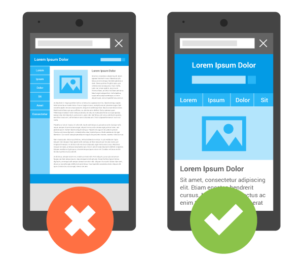
A mobile-friendly website is designed to work in the same way across devices of different sizes, from desktops to smartphones and everything in between.
This means that none of the website’s elements is changed or unusable on smaller devices. However, some features are limited (such as navigation dropdown menus) since they can be hard to use on mobiles.
Also, the use of Flash animation is avoided to prevent usability concerns on various screen sizes. For the most part, mobile devices don’t support flash. Flash is obsolete, even on desktops. There are a lot of other compatible technologies to use instead, such as HTML. If you need to do something more complicated on mobile, you better use an app.
Some key features of mobile-friendly websites include:
- Simplified navigation
- Static content that doesn’t change
- Smaller images and text (but still easy to see and read without squinting)
- Buttons and links that are displayed smaller but are still easy to tap with a finger
- Pages that don’t rely on a mobile operating system to work properly
There are great benefits to having a mobile-responsive website, including a positive ranking signal, improved user experience (UX), and the ability to provide a streamlined experience across all devices.
Keep in mind that mobile-friendly websites are coded for “easy” interaction on mobile devices, this differs from responsive web design. A responsive site changes or “responds” based on the device used to view the site.
For example, some images might be hidden, and text might be changed from a three-column layout to a one-column display. Consequently, a mobile-responsive page might look completely different from one on a desktop.
Real-World Examples of Mobile-Friendly Sites
With billions of users accessing the internet through their smartphones daily, businesses are recognizing the need for mobile-friendly sites, and there are countless website designs to get inspiration from.
Here are three of my favorite examples of websites that companies have optimized for mobile devices.
Example #1: Shutterfly.com

Shutterfly is an online platform for creating custom photo books, prints, cards, and personalized gifts. The majority of people take and use photos on their smartphones. That is why it’s necessary for a service such as this one to have a mobile-friendly website.
Shutterfly does this exceptionally well, thanks to the brand’s focus on creating an outstanding mobile experience for all its customers.
Firstly, navigation is a breeze, making it easy for users to quickly find the information they need on the website. Also, the platform uses lots of beautiful, optimized imagery to attract customers to their offers.
Why This Website Works:
- Easy navigation
- Large buttons for menu items
- Use of beautiful, large photos to sell different offerings
Example #2: Cheetos

Cheetos uses an exciting range of eye-catching imagery on its website. They do it in a mobile-friendly way that doesn’t sacrifice website speed and user experience.
The entire design makes it easy for mobile visitors to instantly browse through selections of images and videos that sell popular products and keep users engaged on the website.
Why This Website Works:
- Simple navigation menu
- Image sliders make browsing easy
- Use of an image grid that displays beautifully on mobile
Example #3: Huffington Post

The Huffington Post is a well-known news outlet that reports all types of news, from politics and current events to technology, entertainment, and more.
The publication has a unique mobile website where they change some of the headlines slightly to make content more scannable for mobile users.
For the most part, their mobile version typically has fewer words on the homepage compared to the desktop version. This makes it perfect for reading or skimming news on smaller screens.
A simple, clickable menu also lists out all the post categories for easy navigation.

Why This Website Works:
- Simple to use clickable menu
- Fewer words on the mobile version of the site
- Easily scannable titles
How to Create a Mobile-Friendly Website
There are a lot of misconceptions when it comes to building responsive and mobile-friendly sites.
One of the top mistakes beginners make when building mobile-friendly websites is to work in isolation. It’s so much better to get inspiration from those who’ve already done it.
The examples above are a great start, but you can also check out other websites in your industry or niche (particularly competitors). This is how you will get more insight into their methods, and best practices used to create a mobile-friendly website.
1. Use the Right Website Builder
The first step in building a mobile responsive website is to use an appropriate website builder. Choose one that specifically states that it’s for designing sites to be viewed on mobile devices. Most modern site builders have the mobile experience top of mind.
A website builder will make it easy for you to create and launch a website that is both desktop- and mobile-friendly. There are many different website builders to choose from, including platforms like WordPress, Zyro, Wix, Squarespace, Weebly, Shopify and many others.

Most of them offer free versions, but you will have to upgrade to a paid version if you want to remove limitations and access additional features such as email marketing.
For example, when using a free website builder, you’ll be able to build a mobile-friendly website but on a subdomain, such as YourAwesomeWebsite.weebly.com, instead of a unique domain: YourAwesomeWebsite.com.
Depending on your level of skill, you can choose a website builder that allows you to either create a website template for mobile-friendly websites or dive deeper into the web design and development process to use HTML or CSS and convert your design from PSD to HTML.
HTML describes the structure of your webpage, and CSS tells the browser how to present that page, including colors, fonts, and layouts. It also allows you to adapt your webpage to different device types, screen sizes, and mobile operating systems.
Regardless of your technical knowledge and expertise, it’s always best to focus on simple designs when building mobile-friendly websites.
Mobile users have notoriously short attention spans, and focusing on simplicity will make it easy to keep your users’ attention on the content you want them to see as opposed to having elaborate, complex themes.
2. Test the Website On Mobile Devices
Once your site is built, the next step is to test it on mobile devices to ensure that everything works the way it should. In addition to checking the mobile-friendliness of your website across multiple devices, mobile website testing also offers the following advantages:
- It Makes Your Site Easily Accessible: Users can access your site via any browser across multiple mobile devices.
- It Makes Your Site More Visible: Performing mobile website testing also makes your website easier to find since Google prioritizes mobile sites compared to desktop apps.
- It Improves User Experience: A mobile-friendly website improves how the website looks and feels, which makes for a better UX.
To test your mobile-friendly website, you can use a dedicated tool like Google’s Mobile-Friendly Test, which you can access right here.
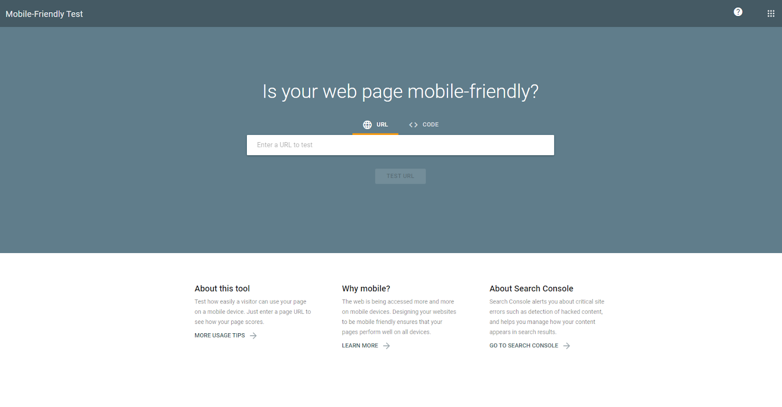
This tool allows you to test how easily visitors can use your website pages on mobile devices. Simply enter a page URL, and you’ll be able to see how your page scores.
The tool may show that your site needs a lot of work, so you’ll have to prioritize making your website into a mobile-friendly one so you can improve its visibility in search engines.
If you get the thumbs up, your website is mobile-friendly and doesn’t require the same level of priority, but you can always benefit from improving user experience in any way you can. Every little bit helps, and whatever you do will help ensure more of your website visitors stick around so you can boost your conversions and make more sales.
Alternatively, you might choose a free browser tool like Responsinator, which allows you to resize your website to any size so you can see exactly how it looks on different device screens.
Lastly, in addition to mobile-friendliness, Darshan Somashekar, who runs the gaming platform Solitaired, suggests running a page speed test on your mobile site. “While being mobile compatible is important, Google now measures core web vitals. We measure this regularly for our solitaire games. If your page doesn’t load quickly and efficiently, not only will users bounce, but it will impact your search ranking.”
3. Optimize Image Size
Another thing you can do to ensure that your website is mobile-friendly is to size pictures correctly for optimal mobile device viewability.
When dealing with small screens, the goal is to use images with the smallest file size possible while still looking clear and crisp on the screen on which readers view them. This is because mobile devices have a much smaller bandwidth than desktops, which can cause longer loading times if you don’t optimize them.
If your users need to download a 1-MB JPEG file just to see a thumbnail-sized image, they will likely become frustrated and bounce from your website. It won’t matter just how nice your website design is. If you can’t improve the user’s experience by reducing load times, they will likely leave your site for one of your competitors.
So make sure you shrink all your image file sizes so you can use less of their data and help load pages faster. Doing this will contribute to a positive image of your mobile website.
4. Ditch Text-Blocking Ads and Pop-ups
Another way to ensure your website is mobile-friendly is to only use discrete mobile marketing ads that are discrete and don’t distract from or cover your mobile content.
No one likes ads in any context, and when users are trying to read text on a small screen, the last thing they need is a popup blocking their view of the page. Rather than take the time to try and find that little “x” to minimize the popup ad, users will likely just click away to find a website with a better user experience.
Avoid annoying your users and create an enhanced experience by steering clear of popups and ads that block the content of your page. If you can’t remove them entirely, then at least disable them for mobile users.
Alternatively, you can set it up so that popups or ads only appear when users have scrolled to the bottom of the page, rather than showing them as soon as people land on the page.
Also, make sure the “X” to cancel the popup or ad is big enough for users to find and select it easily.
5. Make Website Speed a Priority
Finally, check that videos and other interactive content on your site are not causing website lag. Mobile users don’t like to spend more time than necessary searching for the information they need on the website, so you need to make sure you provide them with results within seconds.
These days, people demand instant gratification, and if they don’t get what they need immediately (as in almost at first glance), you can be sure they won’t wait.
Your website shouldn’t take too long to load completely. It should be presentable, and all the important elements should be accessible in just one or two scrolls down. Failure to adhere to these design points will likely result in users switching to another website.
Conclusion
I hope this article has helped you understand exactly what a mobile-friendly website is and the steps you needed to build one. Use this information to help you design a website that will look as great on mobile as on desktop.
Has this article answered all your questions on how to build a mobile-friendly website? Share your opinion below!
BYLINE:

Ron Stefanski is a website entrepreneur and marketing professor who has a passion for helping people create and market their own online business. You can learn more from him by visiting OneHourProfessor.com
 Previous post
Comments
0 commentsNo comments yet