Los 10 mejores sitios web de reservas de belleza con SimplyBook.me
This post is also available in:
Have you been wondering how to make a gorgeous beauty website that incorporates everything you want to tell your clients about your business AND allows them to book appointments with you? Well, look no further. SimplyBook.me is a comprehensively customisable booking system that lets you create a beautiful beauty booking website while also managing your business functionality.
If you don’t believe me, here are some of our favourite beautiful beauty booking websites, from the most minimal to the flamboyant. Customisation is key to making your beauty business stand out against the competition and creating a brand identity that will see your name on everyone’s lips.
Isabella Kosmetikstudio – Lucerne, Switzerland
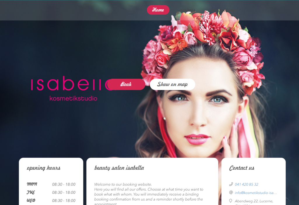
Isabella Kosmetikstudio in Lucerne is one of my favourite beauty booking websites. The vibrant colours and images in the service descriptions make this website really «pop».
Nothing works better to make people believe in the power of your beautifying techniques than a gorgeous person on your beautiful booking website page. Isabella also continues the theme throughout the booking process, with beautiful and creative imagery for each treatment category and some of the individual treatments.
I love how they have created a separate category where they develop new packages and offers, it’s not a technique I have seen often, and it’s always at the top of the services list.
Cocoonin’ Paris – Paris, France
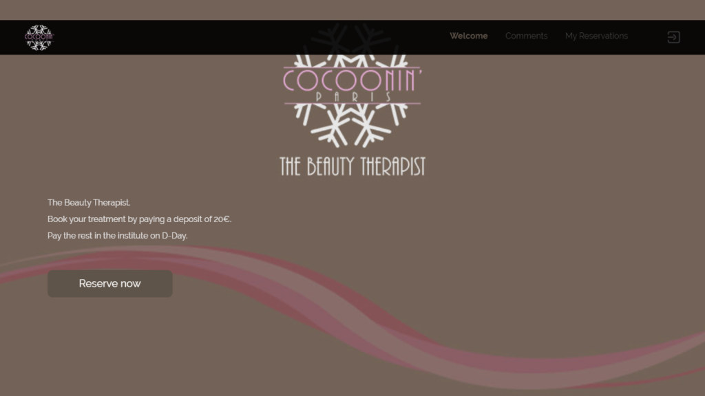
There is nothing wrong with a minimal approach to your branding, and Cocoonin’ Paris is just that. With warm and calming colour schemes, it gets straight to the point without overwhelming the client with information. If you want to book straight away, the button is right there. However, if you scroll down to the bottom of the page, you have all the information you might need to make your mind up:
- Address
- Opening Hours
- A map
A beautiful booking website that continues the calm and straightforward theme throughout but also makes full use of the images for each service. Something compelling about before and after shots makes clients think, «I want that».
Balm & Bubble – Two Locations in Texas, USA
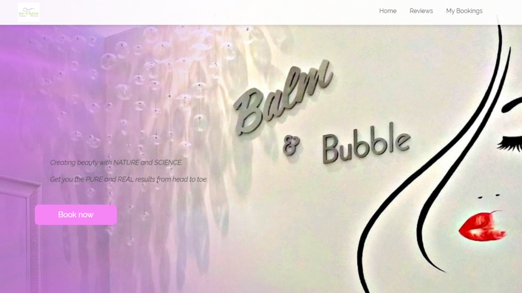
Located around Austin, Texas, Balm & Bubble has two locations, one in Cedar Park to the North and one in South Austin.
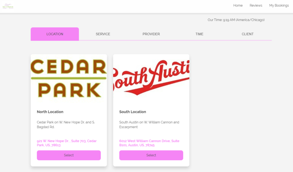
I would be tempted to suggest a better-sized image for South Austin However, the imagery and descriptions for the services in each location are spot-on. Very attractive and fully descriptive for the clients. It’s always better to give more information than leave potential clients wondering.
It’s terrific that there are special offers for new clients at the top of each location and full descriptions.
Upon completing the booking confirmation, I particularly like the ease with which the booking can be cancelled if the details are incorrect, which makes both the business and the clients able to manage the schedule.
Tahiti Mana Tamau – Tahiti
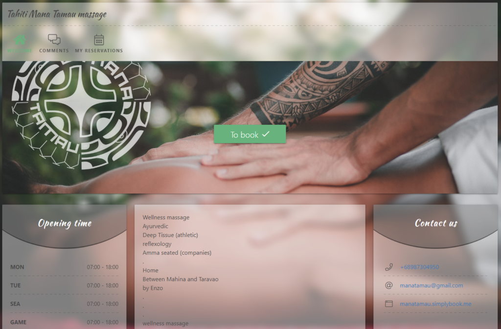
This is a beautiful booking website, even though it’s more about feeling beautiful than looking gorgeous. However, the first image says everything it needs to. If you seek a massage service, you want to know what they are about. All I can think about with this landing page is a pair of strong hands easing all of my aches and soothing my stresses. The indication of local plants also makes you feel like relaxing in the natural world.
What also makes this a lovely website is the immediate list of specialisations this masseur offers, on-site or in your home. Another thing that makes this booking site great is that it only has a short banner image, making the critical information about the business, i.e. opening times, contact details, and business specifications, instantly visible «above the fold».
Trueliving Spa – Bandar Seri Begawan, Brunei
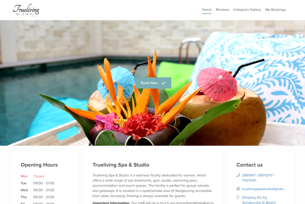
Sorry gentlemen, but this beautiful booking website is for a women-only spa and studio. However, it is still a gorgeous booking website.
I have never been to this spa, so I have no firsthand experience, but this gorgeous booking site makes me want to hop on a plane to Brunei for the occasion.
The person who sets up this system knows exactly what to include to entice clients into their spa. Using the full range of formatting features in the service descriptions, each service and package option is a burst of colour, information and an indicator of true luxury.
More specifically, I love the idea that if you can’t find the package you crave to soothe body and soul, you can always add extras to make your spa day as close to perfect as possible.
Easy access to reviews from the menu bar at the top of the page makes it an easy sell – not a bad word to say about experiences or staff members. While this is a body beautifying spa, there is so much to choose from; you know that you’ll leave the spa feeling truly pampered and divine.
The Om Shoppe & Energy Spa – Sarasota, Florida
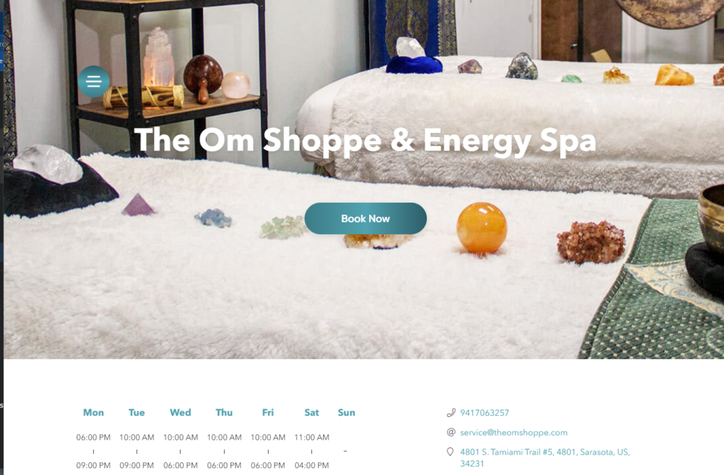
Beauty comes from within; if you feel good, you look even better. Spiritual and energy healing is not different from having an invigorating or relaxing massage to make you feel (and look) better.
If this is not your thing, you may not find the beauty on the website. However, even if you have never tried the spiritual or natural energy route to beauty, you can see and appreciate how this beautiful booking website flows.
Massage and alternative therapy services are available for clients with specific and informative description fields. An excellent option that I think is fabulous is the personalised online shopping appointment. Personalised guidance around a large store by someone who knows the products and allows online shopping with a much more specific focus.
BeiaMed – Miami, Florida
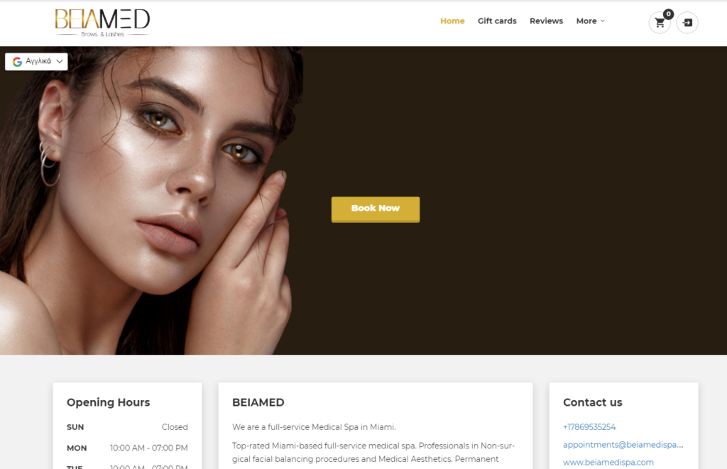
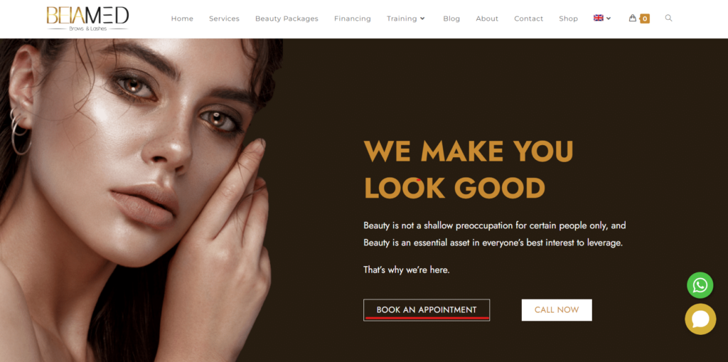
It might say brows and lashes in the title, but BeiaMed Spa offers much more. A beautiful and glowing woman on the from page makes us want to feel that glow, even if not actually glowing.
There is a beautiful flow to this beautiful booking website. The first category of services is the free consultation available to all permanent make-up and fillers clients. Making it easy for clients to make a free appointment for their consultation.
Everything from lashes and fillers to weight loss and tooth whitening. BeiaMed has beautiful imagery, clear descriptions and a straightforward flow through booking confirmation.
Diana Lash Studio – New York, New York
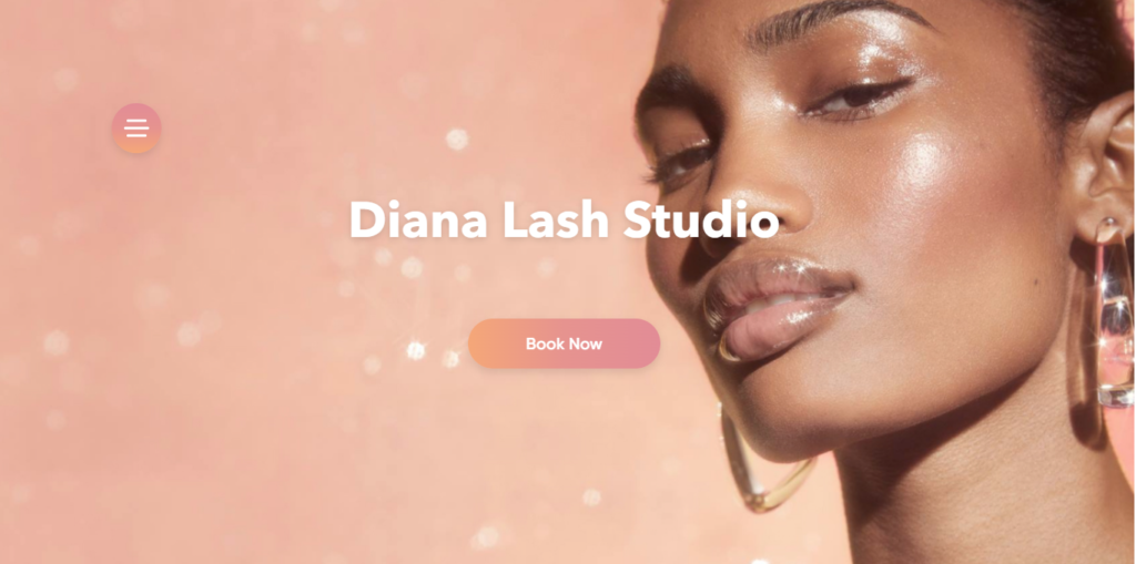
Diana Lash Studio certainly knew what they were doing, having a woman peering through her gorgeous and natural-looking lashes.
Lashes might be a very narrow niche, but that doesn’t mean they don’t have a place on our beautiful booking websites. With options for each of three types of lashes, cashmere, luxury volume or Russian volume, there is even an option if you need some guidance on the kind of lashes that would suit you best. The look wouldn’t be complete without beautifully shaped eyebrows to complete the look.
I love that you can see the difference between the lash types on the description images, and the description also explains how they achieve the look.
Essence Lis – Queenstown, New Zealand
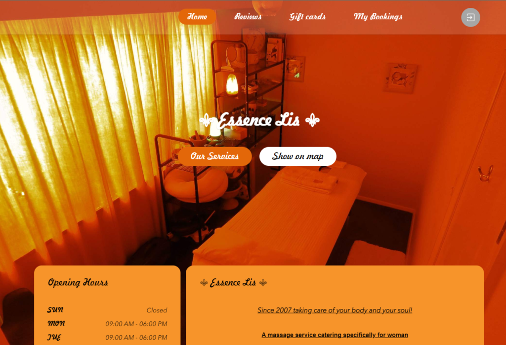
This is not one of my personal favourites, but I suspect that it has more to do with my aversion to orange as a colour. Yet I cannot ignore the website’s warmth, beautiful flow, and the broad range of wellbeing services. I want to have a go with all of them, but New Zealand is a little out of my travel budget.
Essence Lis has recently added a new category for new package services. Offering complementary services to make the perfect wellness session. Even better is the ability to add additional services to enhance the experience further.
While I may not be a fan of the orange theme, I can’t debate the beautifully coordinated colour scheme that is both warm and welcoming. Moreover, the image of the treatment room is both calming and cosy for those looking forward to their service.
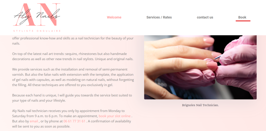
Aly Nails – Cabasse, France
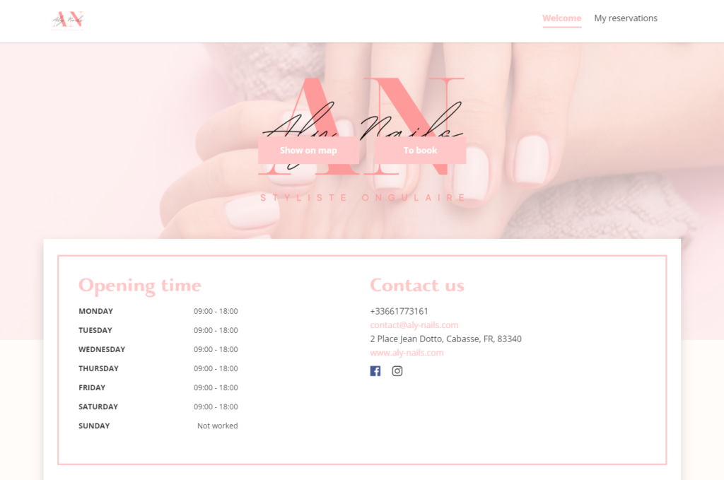
Beautiful nails can be the perfect finish to a warm handshake and greeting. No one ever said beautiful nails had to be pointed talons or of extreme length, and Aly Nails shows that they can accommodate your preferred size and shape for the best result.
Pretty new designs and simple enhancements for any taste.
And let’s be fair, beautiful nails aren’t nearly as effective without a bit of pampering for the appendages they are attached to. So including manicures and pedicures only makes sense. I would certainly appreciate an excellent mani-pedi with a set of gorgeous nails.
Already Have a Beautiful Website but No Booking System?
That is not a problem. No one wants to have perfected their website only to realise it doesn’t meet all of their needs.
Three of the businesses above have both a booking website and a beautifully crafted one that gives much more information. The beauty is that your booking website can carry the same branding and themes to ensure you always have a clear connection between your customer contact channels.
Moreover, you can link directly from your website to a booking page using a subdomain, integrate a booking widget into your website pages, or completely integrate the system using the API.
Check out the websites for Isabella Kosmetikstudio, Coccoonin Paris, and BeiaMed to see how they seamlessly connect a beautiful booking system with an existing website.
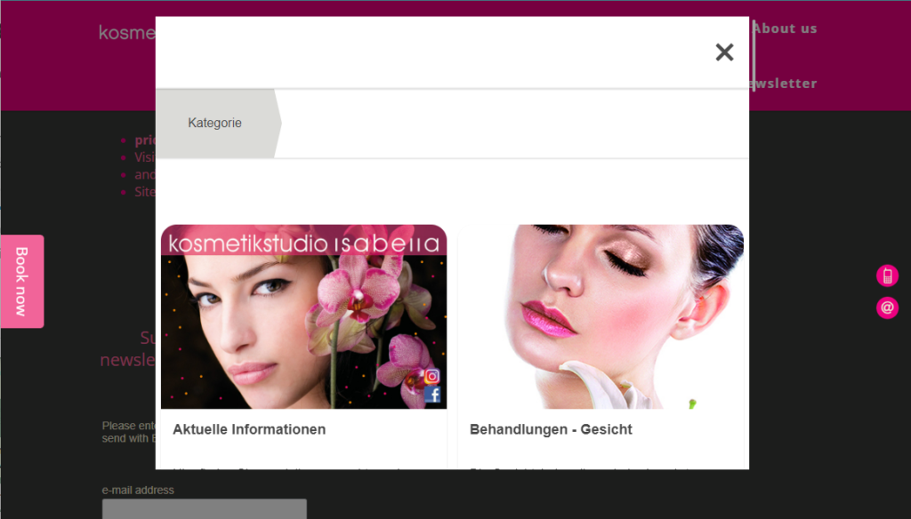
Isabella Kosmetikstudio used the book now button on the side of the screen to bring up a widget on the website. It follows the same booking process as the booking website and maintains its brand identity.
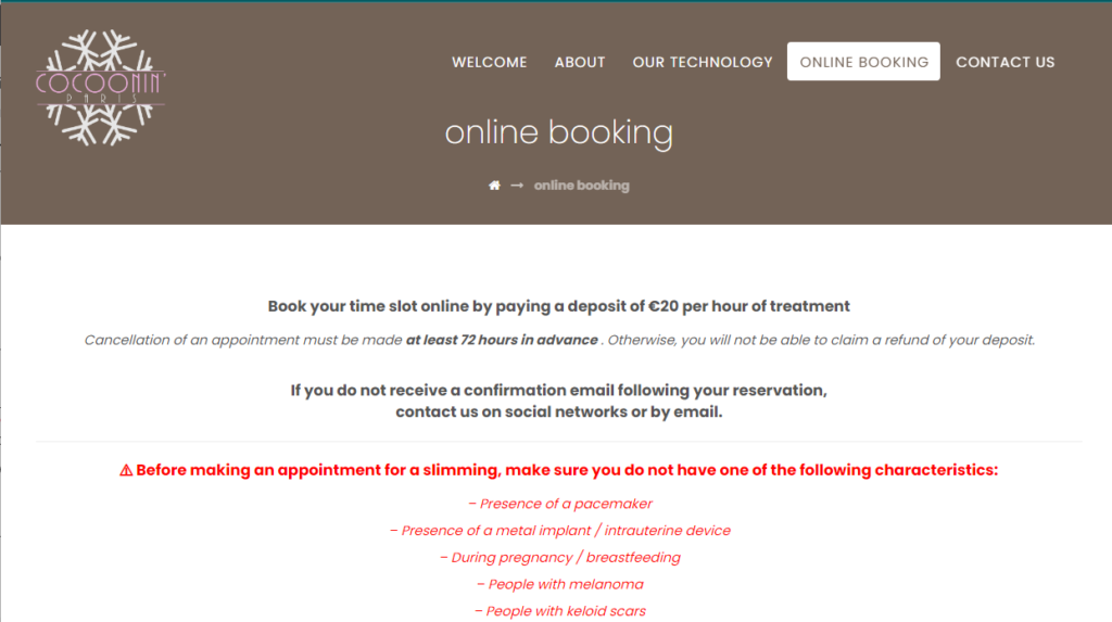
Cocoonin’ Paris has a separate page on their website that houses the booking process directly from SimplyBook.me. The booking process is identical. However, clients will not have to leave the Cocoonin’ Paris website to make a booking.
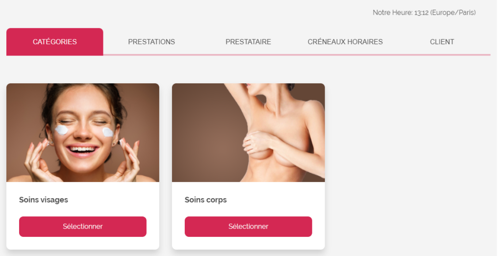
Both BeiaMed and Aly Nails use a link from a menu option to link directly with the beautifully designed booking website provided by SimplyBook.me. However, BeiaMed will open the booking page in the same tab as the website – so unless clients pay close attention to the URL in the browser address bar, they might not know they are leaving the BeiaMed website. Conversely, Aly Nails will open the booking pages in a new tab.

Comments
0 commentsNo comments yet