This post is also available in:
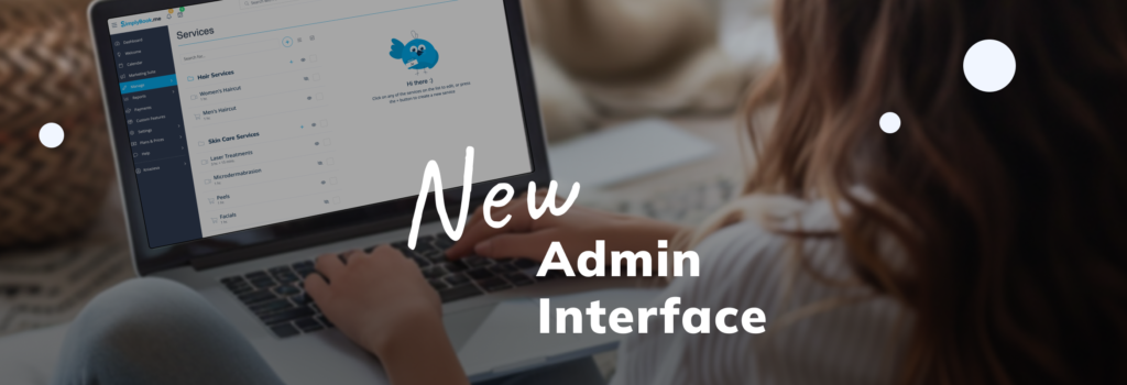
We are excited to announce the new updates to the SimplyBook.me admin interface. Our team has worked hard to bring you a more modern and improved design. Here’s a breakdown of the changes we made:
Dark Mode Theme
We have created a Dark Mode theme. This theme reduces eye strain and provides a sleek, modern look.
New Common Style
The admin interface now has a new common style, making it more fresh and modern. Most pages, except the Reports section, have been upgraded to this new look. Action buttons and other items have a common positioning for easier navigation.
Reorganized Buttons and Floating Action Buttons
We reorganized some buttons to make the interface more user-friendly. We added floating buttons for longer pages like Design and Widgets settings, Email & SMS settings, Custom translations, and Main configuration. As you scroll, action buttons remain at the bottom of the page. For example, the main configuration settings now have a “save system settings” button at the bottom, saving you from scrolling back to the top.
Design Page Enhancements
The Design page now features a more noticeable preview. Settings are organized into blocks for a cleaner look.
Improved Custom Features Page
Our custom features page is now easier to navigate. You can hide categories and open only the ones you need. Previously, this was possible, but the button was small and hidden. Now, it’s more visible and user-friendly.
Updated Statistics Design
The design of the statistics in the dashboard has changed. It’s now easier to navigate the most relevant statistics and analytics. The dashboard also features our new common style.
Enhanced Welcome Page
On the Welcome page, help materials are now easier to navigate. When you click the Welcome section, you will see our playlist of useful tutorials to help you get started with SimplyBook.
Profile Icon Relocation
The profile icon has been moved from the top left to the left side menu in the admin panel. This change separates account info, profile, affiliate, settings, and log out. We have created a new page for “account info,” which shows all your account details, including login, emails, and plan details.
Separate Management for Coupons and Gift Cards
You can now manage coupons and gift cards separately. Click on Gift cards to see only your gift cards, or Coupons to see only the coupons. You can also see a list of both if you don’t click on one. This allows for easy management.
Improved Mobile Menu
For mobile devices, the menu has been improved to be more user-friendly.
We believe these updates will make your experience with SimplyBook.me even better. Enjoy exploring the new features!
Final Thoughts
Our goal is to make the admin interface as intuitive and efficient as possible. We hope these updates enhance your workflow and make managing your bookings easier than ever. Thank you for being a valued user of SimplyBook.me.

